Websites provide a communicative voice giving credibility to businesses by providing value and necessary information to visitors.
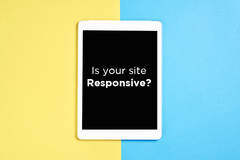
Having a user-friendly site is key to good design
As more people are using mobile devices and tablets to browse the internet, there is more to think about in terms of design and SEO. If a website is not designed for mobile, a high rank in search results will not last long. Google will interpret a high bounce rate as a website that is not offering relevant content and most likely suffer by dropping in rankings.
Offering an outstanding viewing experience
Over the years, building websites has become more complex. Not just viewing a site on a desktop computer but with the changing environment of devices, browsers, screen sizes and orientations. Mobile-friendly web design ensures users will have a good viewing experience on all devices and look great at any size.
Before responsive design the trend was to develop multiple sites for each device. The downside was an increase in costs for development, maintenance and SEO promotion. Instead of a fixed layout, a responsive layout allows the design to be fluid, flexible, and adaptive.
Advantages of responsive design
Ethan Marcotte who is an independent designer and author, based in Boston, Massachusetts coined the term “responsive web design” to describe a new way of designing websites in this rapidly changing web world.
In 2010, Ethan wrote a piece and published on A List Apart, Responsive Web Design, discussing the advantages of adapting a “responsive” design to accommodate any device type and screen size. He also has discussed techniques, principles, tips, and tricks in his book that was first released in 2011, Responsive Web Design.
Building scalable layouts
Responsive mobile-friendly design calls for building scalable layouts that adapt to any screen.
- Shifting of design elements as screen size shrinks
- Navigation that collapses and expands on screen size
- Graphic images that shrink to a smaller size or are removed on mobile devices
- Alignment of text that changes with screen orientation
Contact Sequel
Contact us today to see how SEQUEL can help with your next responsive website design.